How it Works:
- Logarithmic graphs are used in Precision Teaching and fluency-based programs (e.g., SAFMEDs) to visualize rate-based performance over time.
- The Y-axis uses ratio scaling so proportional growth (e.g., doubling responses per minute) appears evenly spaced and trend slopes reflect acceleration.
💡 Values must be positive, as logarithmic scales cannot display 0.
💡 Exclusively for rate or frequency programs
When to Use the Logarithmic Line Chart:
- You are tracking frequency or rate data over time and want to visualize learning speed, not just current level.
- You want to compare acquisition rates across programs — slopes on a logarithmic line chart are directly comparable.
- Behavior counts span a wide range and a linear chart makes low or high counts hard to read. Logarithmic scale keeps both readable on the same chart.
- You are running Precision Teaching programs and analyzing learning rates rather than just performance levels.
- A trend looks flat on a regular line chart but you suspect there is meaningful proportional growth happening.
How to Enable the Logarithmic Line Chart Display:
💡 Once your program is set up and you have taken data, you will be able to view it in a logarithmic chart display by following the steps outlined below.
-
Navigate to the program graph and select the 3 horizontal lines to the top right of the graph to view your settings toolbar.

- Use the filter options of the settings toolbar to make the following adjustments (top-down):
-
- Period; select from an option, or create a [Custom period]
- Data Source; select [Session Data]
- X-axis; select [Session] for a detailed view of session data
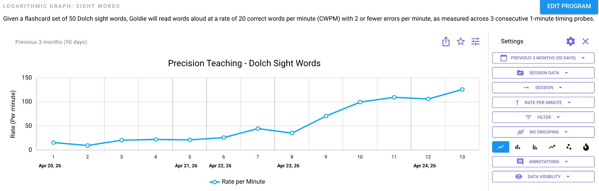
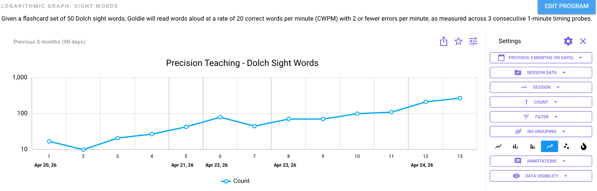
- Data; select from one of the following [Count], [Rate per Minute], [Rate per Hour]. Or [Rate per Day]
💡This is your Y-axis - Select the logarithmic chart display from the icons on the toolbar.
-
Example data visualizations below for reference:
- X-axis set to [Count]:
- X-axis set to [Rate per Minute]: